Today I am championing the forgotten craft of writing. Many of us have handwriting that we wouldn't naturally describe as 'artistic', and yet with a few tweaks and changes we can make the most ordinary handwriting beautiful! So here are a few ways to get started...
The first photo pictures my handwriting. I haven't rushed it, but I have not laboured over it either (I do want them to look like I have written them, not used a computer font!). In order to get the lines straight I used lined paper underneath, which isn't picked up on this photo.
Once I have finished I draw another line next to each downward stroke on every letter. This is parallel to the writing and can be as far apart as you want to make it.
Now fill in the gaps between the two lines on each letter making it look almost like calligraphy.
This technique can make good any mistakes because you are just colouring them in!

Finally, I finish each letter off with a small horizontal line at the top and bottom of each long letter, i.e. on the T, H, Y etc.
This photo is of five different ways to make your writing more interesting!
The first is my normal, block writing…not great!!!
The second line is writing where I have enlarged one or two letters to make it more fun. A good example of this is the writing on my chalkboard page. See link.
The third line simply dots the end of every letter. My creative mum taught me how to write like this as a small child and it is so clever how it transforms any writing! Try it…I dare you!!!

The forth line is better demonstrated in the picture here. It takes some practice because it goes against your natural formation of letter, but it is a fun way to write and is lovely when addressing envelopes.
The principle behind it is to make every letter the same height, stretching from the top of the line to the bottom of the line. So you can see that the 'a' in 'Katy' is proportionally much larger than the 't' and the 'y' sits on top of the line rather than sinking below. It is immensely fun and quite challenging to undo years of learnt behaviour.
Here is another way to jazz up your writing. Write the name or title you want to decorate. I am using an envelope and have made my writing much larger than I would naturally do. This allows me more room for adding creativity.
Now I add the same parallel lines down each vertical line (as mentioned above). Instead of colouring them in I draw lines as the filler. You could also use colour.
Finally, I lengthen some of the lettering to add a sense of fun and then finish with the horizontal bottoms.
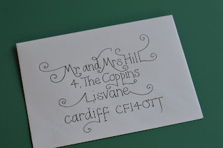
I am going to end with an envelope design. I have drawn on a scrap bit of paper some lines to follow and I add in a centre line to help me centre the writing. I insert the scrap paper into the envelope so I can see what is straight.
The easiest way to find the centre of each line is to write it in your natural handwriting on scrap paper and draw a line down the middle of the writing. Then you know what part of the line will need to land up in the centre. If you want to be particularly cautious you should draw the middle letters in first and then work from middle to the edges of each line.
Once you are satisfied with the writing add anything extra to decorate. I have added curls to some letters, but I have tried to mirror the right and left side of my writing. If embellishing a letter on the right side of a line I will find one on the left side to embellish too. This leaves a more balanced finished look.
I do have to apologise about the lack of other examples of where you could use your lovely handwriting…perhaps labelling jam jars, cake tins, school books, birthday presents, etc. I had every intention of photographing lots of examples but the sun is shining and I must work on my tan!!!
This blog entry is dedicated to my mother who is the most creative person I know and who has never lost the art of beautiful handwriting.


No comments:
Post a Comment